“Did you watch it in black and white, or in true hue color?”
That’s the question going around the internet after Amazon Prime’s Spider-Noir debuted on May 25th. Spider-Noir is a Marvel property following an alternate universe Spider-man, one in a 1930s black-and-white world of gangsters, private investigators and alternate history. The character was introduced during Marvel comics’ 2009 run of Spider-Man: Noir #1. The series featured a Spider-man in the depression era as a hard-boiled detective and gritty vigilante.
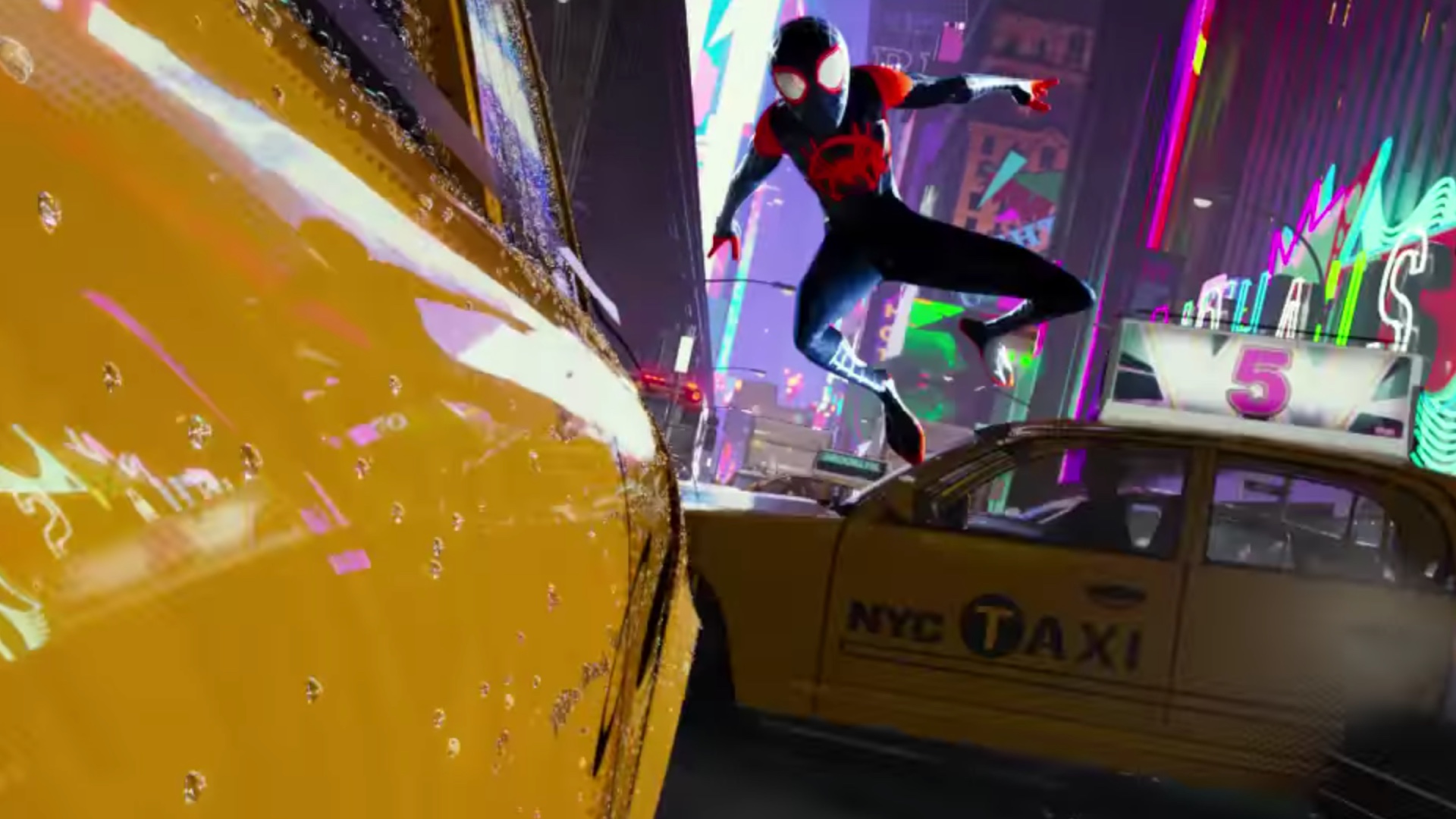
The character would be introduced in animated form with Spider-man: Into the Spider-verse as one of the many alternate universe Spider-men Miles Morales meets. Spider-man Noir is voiced by Nicholas Cage. I wonder at which point producers Phil Lord and Christopher Miller went “You know, this character should get a live action spin-off.” You might also recognize those names from Project Hail Mary and Sheep Detectives. Jeez these guys just can’t miss right now.
The full 8 episode Spider-Noir series has dropped on Amazon, and the response has been astoundingly positive.
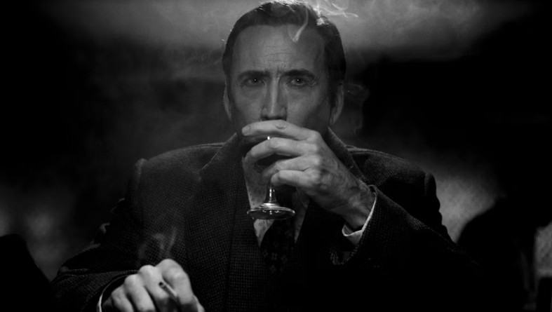
One of the gimmicks about this show is that you can choose to watch it in “true hue color” or black and white to complete the noir theme. I watched the first episode, started in black and white, switched to color for a couple scenes, then finished the series in black and white.
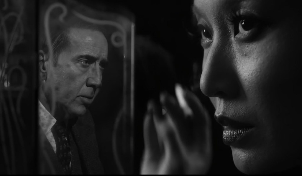
I can’t tell you just how good this series looks in black and white. The contrast, the light effects, the super power VFX… Plus it helps sell the noir aesthetic.
I love seeing bold choices being taken. Something similar was attempted by Disney+ with the Halloween special Werewolf by Night. It was originally presented in black and white, then a color version came the next year.
Black and white screenings have also been offered for other traditional movies, like Godzilla: Minus One and Mad Max: Fury Road. But those were rereleases and not the intention from the beginning. That only represented a chance taken after people already enjoyed the original version of the film.
The Color … or Lack thereof
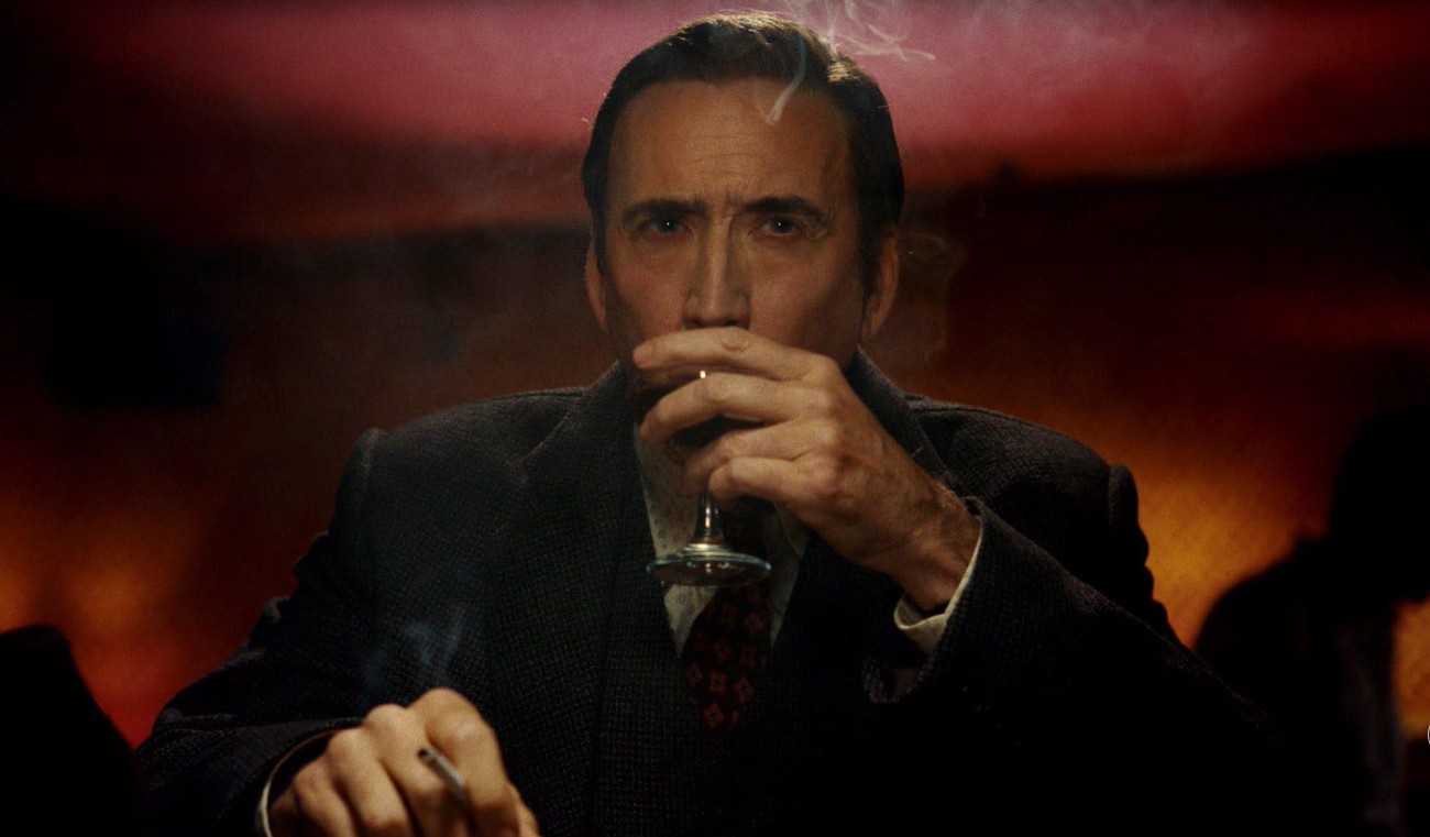
“The truth is, they both work and they’re beautiful for different reasons. The color is super saturated and gorgeous. I think teenage viewers will appreciate the color, but I also want them to have the option. If they want to experience the concept in black and white, maybe that would instill some interest in them to look at earlier movies and enjoy that as an art form as well.”
-Nicolas Cage to Esquire
With black and white movies, there’s a careful consideration that has to be taken to portray colors accurately on screen. Really.
For example, red lipstick won’t read well, so green lipstick would be used instead. The viewer watching in black and white would never tell the difference, but subconsciously they’d see the actress wearing the boldest of red lipstick.
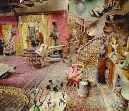
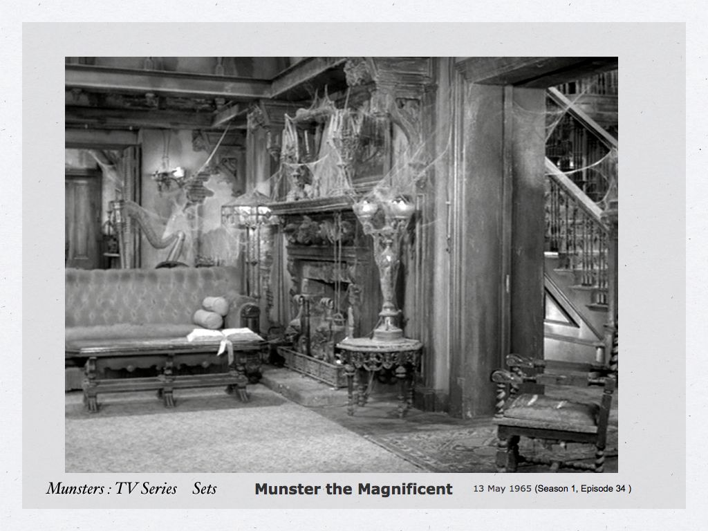
In The Munsters, their drab, haunted old house was actually a bunch of peppy colors like pink and yellow because that’s what showed up best in black and white.
In Spider-Noir, the original idea was to just have the show presented in black and white. A change after the fact lead to the need for extensive reshoots.
“We shot true noir style on set for a B/W delivery. The sets were all painted green, brown, and pink to compliment the gradients of grey in BW. The color pass was not originally planned and required reshoots for almost a year.”
– K.C. Lauf, 2nd Unit Loader for Spider-Noir
Arsenio Alvarez who worked in post production for Spider-Noir, corroborated the story in a following comment:
“Hey! as someone who was on the post production side, yes! The color was an after thought! We got the deliverables then the studio (not Sony 👀) decided they wanted color. So the way to watch it is in Noir (B&W) to get the true filmmaker’s vision.” -Arsenio Alvarez
Every article on the internet seems to be asking “Should you watch it in black and white or in color?” Seriously every article says that. But honestly this is great marketing for the series. Plenty of people will be intrigued enough to flip back and forth, or to rewatch in the other format to notice different things.
The Shot Design
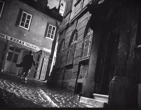
The noir theme doesn’t end with the monochromatic display or the subject matter. The shot design also replicates the noir look. It’s a masterclass in classic cinematography.
There’s multiple instances using the split diopter.
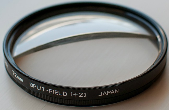
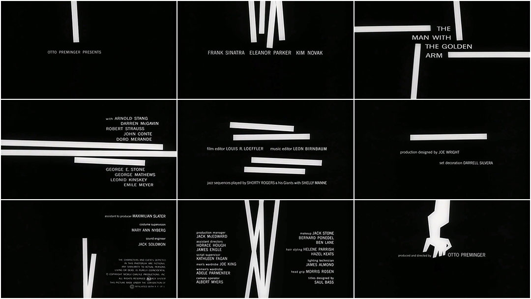
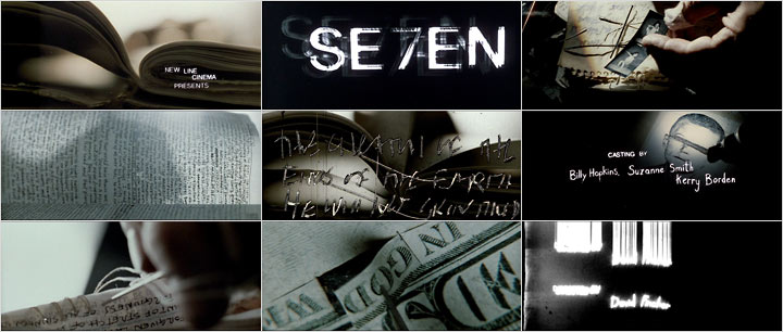
The split diopter is a lens attachment that allows the camera to get focus on a very close object and a far one. This technique is famously used in Citizen Kane. The diopter is a half circle of glass that makes half the lens and half the frame “near sighted” or brings close objects into focus, while the unaltered side of the lens can focus on the background. It creates a dramatic shot that shows two opposing sides of a frame in stark relief. A great way to show conflict or connection, or two sides of the same story.
There’s also a lot of canted or Dutch angles utilized in the series. Dutch angles can be used to create unease or tension, another technique utilized in classic film noir.
I wanted to include more examples from Spider-Noir but unfortunately Prime doens’t allow screenshots and I can’t find the examples I want online. I swear I’m using the screenshots for good reason!
Finally something that isn’t Morbius, Venom or Madame Web
Look. Marvel/Sony tried to get these off-shoots of the Spider-man universe to work.
Well, it almost seemed like they wanted things like Madame Web to crash and burn. That’s a story for another time.
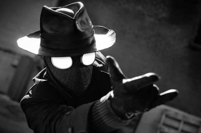
Finally we have a Spider-man character who isn’t exactly Spider-man, to give a fresh take on this comic book world. At its heart, Spider-Noir is about this weary detective named Ben Reilly, his under appreciated Secretary Janet, reporter Robbie Robertson trying to re-break his way into the newspaper scene, and unchecked mob related crime. And then it’s about a masked vigilante. This story is not just hinging on superhero antics, and in fact they make you wait a bit for it. Ben Reilly will tell you from the very beginning that he’s retired.
I’ve had a theory on the concept of “superhero fatigue” for a while, though I’ll admit I’m biased since I love superheroes already. I don’t think its fatigue over the idea of superhero stories (though people will argue with me if they don’t like superheroes already). I honestly think it’s a fatigue over a lack of story. A predisposition to go for the common denominator doesn’t wow people. Trying new things is challenging and a risk.
Taking chances doesn’t always work. Getting weird and experimental doesn’t always land with an audience. But filmmakers (and the producers/studios who fund those filmmakers) have to take a chance now and then and be delighted when it is received well.
Sources:
Taking a Closer Look at the Use of Split Diopters in Film | No Film School
https://nerdist.com/article/classic-noir-film-references-in-spider-noir-tv-series
Watching Spider-Noir in Black and White vs Color: The differences you should know
Prime Video’s New Spider-Man Series Required “Almost A Year” Of Reshoots For Multi-Format Release